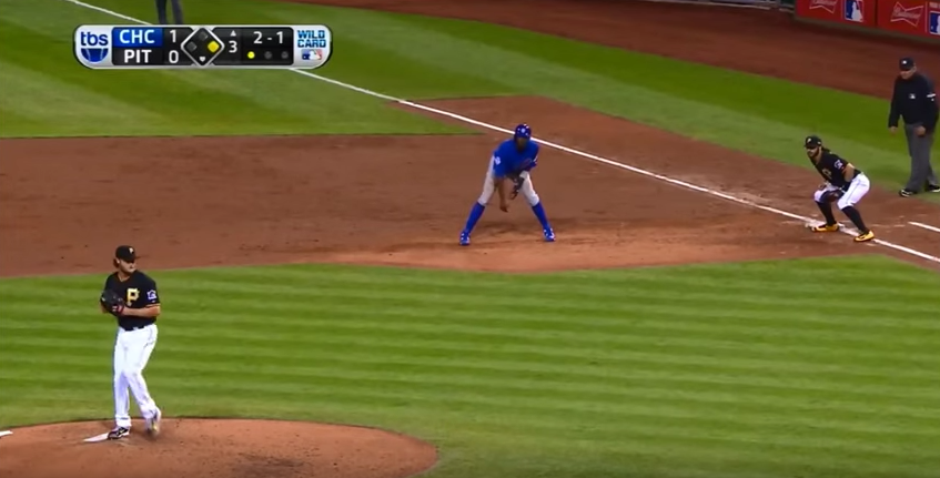
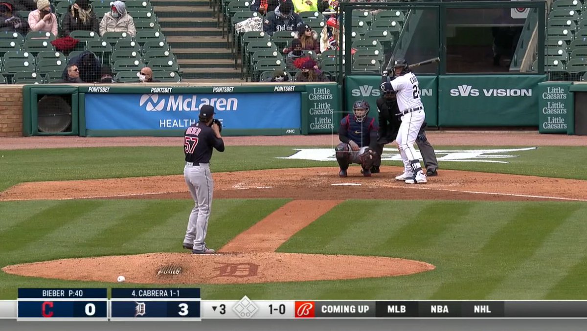
Imagine yourself tuning into an NFL game on a Sunday afternoon. You join the game midway into the second quarter and have no idea who is winning. I can remember those days pre-scorebug, when only once in a while was there a graphic showing the score, down and distance and time left in whatever quarter it was. Primitive right?
In some ways it was great, there was anticipation to see which team was winning. There wasn’t a lot of graphical information shouting at me and I was reliant on the broadcaster to give me the details on the game. Innocent and pure, but proven impractical.
Like it or not, the scorebug is a thing. So much so that debates rage on about what they show, where to show it and yeah, how they show it. What color the bug is, the font that is used how large the graphics are, all stir up feelings from sports fans. Sometimes the angst displayed on social media over the bug, is more than is directed at their team. It’s pretty amazing to think about how routine it’s become to know everything there is to know about a game whenever you tune in.
The scorebug has been around since the early 1990’s. Its origin has been traced back to televised soccer matches. David Hill, who was the head of Sky Sports in 1992, was dissatisfied over having to wait to see the score after dialing in a match in progress. The bug was introduced during Sky’s coverage of the newly formed English Premier League. Hill resisted countless requests by his boss to remove the graphic and the concept caught on in Europe. ITV introduced a bug the next year and the BBC did the same toward the end of 1993 for its’ football coverage.
The first use of the “always on” bug in the US was in 1994. ABC Sports and ESPN introduced the gadget to the American audience during the FIFA World Cup. Though the reasoning for it was not just to continuously show the score. It was used as a way to scroll through sponsor logos as a way to present the coverage without commercial interruption.
The more traditional use of the scorebug came as Hill left Sky Sports for Fox after the latter’s acquisition of the NFL. Hill branded the bug the “FoxBox” as part of its coverage in ’94. Fox’s inaugural box was very plain. White letters and numbers arranged at the top left of your tv screen. It only had the time and quarter in one part and the teams and score in the other. Very basic, yet a novel idea since it really hadn’t been done before. But the “FoxBox” was here to stay despite objections from some fans that were resisting change. The path was established and Fox began using it for its baseball coverage as well. Other networks would eventually follow suit, some were a little less willing to change than others.
There was an antiquated thought process in assuming that people would stay with a game longer, if they tuned in and didn’t know the score. This was definitely old school thinking. Technology was changing. As the 2000’s started to roll in, the internet, smart phones and tablets would take center stage, eliminating the “I wonder who’s winning, I better stick around to find out” way of life. People already knew, so you may as well get with the program and make it easy to see. Everyone eventually got on board, with networks developing their own version of the “FoxBox” in the years to follow.
Inherently there were issues. Some of the boxes were obtrusive, some were too small, some had too much information and some not enough. It seemed like networks, and eventually RSN’s, were experimenting through trial-and-error. A few networks took the feedback from the audience and threw it in the garbage. Others seemed genuinely interested and would change even in the middle of a season. Here in Chicago, the Cubs television home, Marquee Sports Network, was being criticized for only showing who was pitching in their box. Fans wanted to know who was batting as well and they got their wish a few games into this season.
Just think that this phenomenon is only 27 years old. The technology has grown exponentially and you can see the influence the video game age has had on the bug. Those gaming experiences have proven to be a good testing ground for different variations of the scorebug. Figuring out what works and what doesn’t work and what can be taken from the games and incorporated into a broadcast is always evolving. Networks can use feedback from gamers and also just use the eye test to see what looks good and is feasible to work into a telecast.
With that said, the scorebug is still not a perfect thing. Some people love it and some are just simply “bugged” by the bug. I personally think it’s a great addition to television, some are doing it right and some aren’t. Fans seem to generally like the use of the bug, but there are many complaints. Networks have had to pivot many times already as this always changing technology provides new and inventive ways to present the product.
COMPLAINTS
Doing a quick social media search on the subject, there were several themes that popped up when it came to complaints by viewers. Placement of the bug, the font color of certain aspects, like the teams and information, and the size of the box.
I’ve often wondered where the perfect spot for the scorebug is. Across the top of the screen? The bottom? Tucked in a corner? Me, I’m for whatever doesn’t inhibit my viewing of whatever game I’m watching. When the box is in the top left during a football game, it needs to be more horizontal than vertical. Why? If it’s too “tall” you lose sight of the players at the top of your screen. Can’t see the cornerback or safety because they get blocked out. The top left location is also a problem in basketball when it comes to seeing the basket and again, players at the top of the screen. In baseball this location is fine.
Executives and producers need to keep in mind what sport is being broadcast when placement of the bug is discussed. Camera operators need to be aware of the location and keep it in mind, especially when it comes to following the action. It’s vital for fans viewing the game.

I was amazed at how many people complained about the color of certain things within the bug. Most of the complaints had to do with the color of the background when it came to identifying teams. Fans want an exact match of the team’s main color schemes so it’s easier to know who is playing. Trying to figure out who’s who has been an exasperating thing for some.
For example. Let’s say Loyola-Maryland is playing Marshall. Both team’s color schemes are green and black. Marshall is the home team and is wearing their white jerseys. Loyola-Maryland is donning its road greens. Now the scorebug shows a green background for Loyola and a black background for Marshall. Ok, the predominant colors from both teams are being featured and if you don’t know which team is wearing white, you’re left to wonder which team is which. How do you solve that problem if you are a network televising the game? Some, like the Big Ten Network will use a gray background for the home team to nearly match the team’s jersey color.
Also, when it came to colors, ESPN learned quickly that a change to its bug for the College Football Championships was confusing to some. That’s because the down-and-distance graphic was shown in a golden color which closely resembled that of the yellow used for penalties called on the field. They quickly made some changes.
Size was an issue, mainly when it came to font size and the ease of being able to read the bug. Some RSN’s have gone to the italics style for whatever reason, but that wasn’t a source of complaining. Fox’s more recent NFL bug has bigger names which is good. However, the team that has possession of the ball is shown by what looks like a “minus sign” so the score appears to be negative. Placement of “time outs” remains confuses some viewers, especially when the “slash marks” to indicate “TO’s” are oddly placed.
Clutter is a problem according to some. The new Bally’s Sports bug has gotten panned in this area. Many have called it “screen pollution” on some social media accounts and Reddit. People have complained about wasted space to the left of the screen, too much going on with the count and MPH of a pitch and the “dots” being used to count the outs. Many have bemoaned the large, sports ticker with other scores from baseball taking up a huge amount of space to the right of the screen. So newer isn’t always better.
WHAT’S NEXT
With the popularity and legalization of gambling in most states it seems obvious that what is next is betting information. Point spreads, over/under, money lines and prop bets will probably be the next thing to appear. I would think that some of these gambling apps will work in a sponsorship of some sort and while the game is going on, give fans updated lines and props.
CONCLUSION
I’m not sure that there will ever be a perfect scorebug, one that pleases most if not all of the viewers. I don’t think it’s possible. With the RSN’s operating these days, it’s a cookie cutter approach. All Bally’s Sports bugs are the same, just like the old Fox Sports and Roots bugs were all designed by the same folks and used on all telecasts. Uniformity is important to them because they want you to know which network you’re watching, just by the bug. It’s kind of boring and corporate feeling, but I get it. In a perfect world, each team’s crew would be able to cater the bug toward the team, include things that are important to fans of that club. That’s just not seemingly part of the plan.

I’d much rather have the boring bug, than not have one at all. It’s important to me, that if I tune into a game that’s already in-progress, I know the score, the inning/quarter and how much time is left. I can’t imagine how it was before. I don’t want to go back to that period of time when the technology wouldn’t allow for it. But, at the same time, realizing what is really important, the game itself, should be at the top of the list. Just because you have access to “bells and whistles” doesn’t mean they are helping your production. Flashy is great sometimes, but don’t get in the way of my enjoyment of the game.
Andy Masur is a columnist for BSM and works for WGN Radio as an anchor and play-by-play announcer. He also teaches broadcasting at the Illinois Media School. During his career he has called games for the Chicago Cubs, San Diego Padres and Chicago White Sox. He can be found on Twitter @Andy_Masur1 or you can reach him by email at Andy@Andy-Masur.com.


