

Spotify changed its logo into a green disco ball for its 20th anniversary, and the internet reacted exactly how it always does.
They called it cheap. They called it corny.
But it also showed how loved the brand was, because nobody trolls something they’re indifferent about.
At least that’s what I told my exes.
Here’s the part radio should not miss while everyone throws shade at the shiny green meatball — which either describes Spotify‘s new logo or is the name of a ska band that opened for Reel Big Fish in 1998.
For a week, people were talking about Spotify. Not its stock price. Not its podcast strategy. Not the low artist payouts.
By using one of music’s most iconic nightclub visuals, Spotify said, “We are still rooted in music.”
That’s important for a company that spent the last several years expanding into podcasts, video, audiobooks, and creator tools.
Spotify is saying, “We do a lot of things now, but the party still starts with music.”
The Logo Comfort Zone
During my years of creating radio stations, programmers would more often than not open with, “Can I see the logo?”
And anytime it didn’t have a guitar for a country station, a lightning bolt for a rock station, or a neon color for a pop station, they’d look confused.
And I don’t blame them. Too much of U.S. corporate radio looks like nobody designed it to excite anyone. Plenty of programmers still gravitate toward stations that look familiar, and plenty of executives still approve logos that feel safely interchangeable.
Cumulus Media. Jacobs Media. Connoisseur Media. Rogers Media.
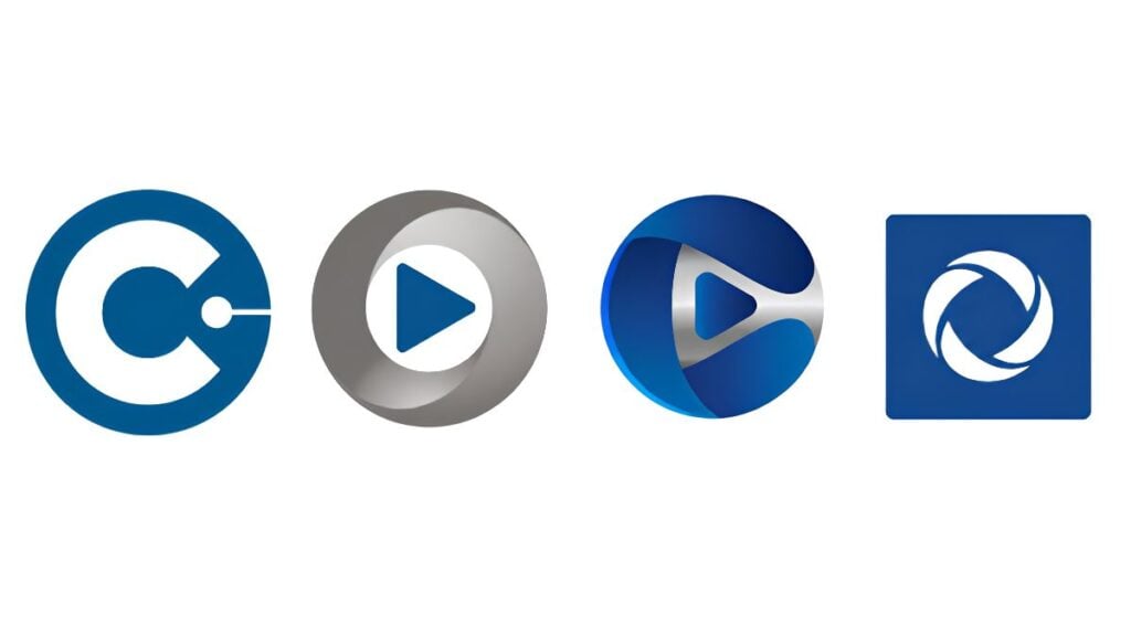
Different companies. Same color. Same shape. Nearly the same logo.
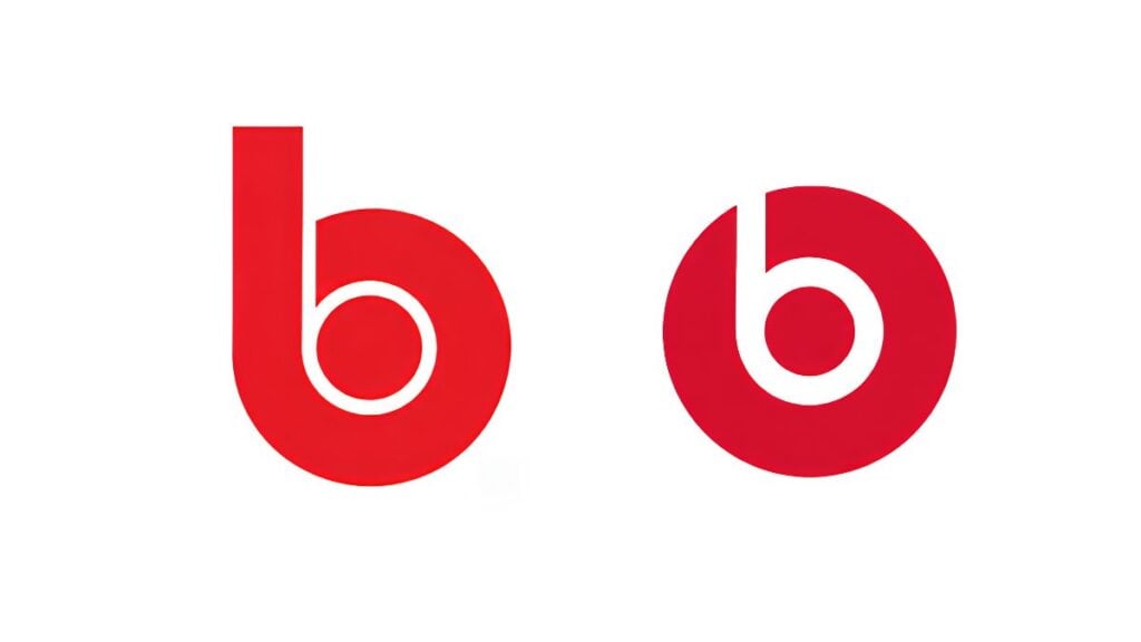
And while we’re here, Beasley Media may want to casually send Dr. Dre and Apple a friendly inspirational invoice. Just saying — if the Beats by Dre logo and the Beasley mark ever ended up seated next to each other at NAB, people might assume they arrived together. Maybe that’s a Q3 NTR opportunity.
The Oddly Familiar Font
It goes beyond logos. The industry repeats itself with fonts, too.
iHeartMedia. Alpha Media. VaynerMedia.
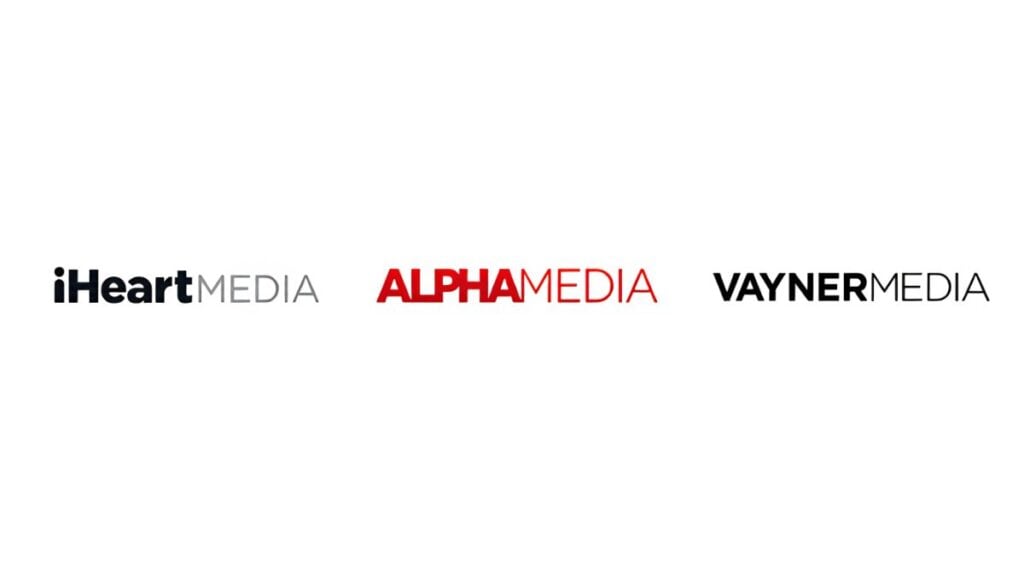
Same familiar thin font, thick font, text lockup, maybe a splash of color if someone was feeling “artsy.”
All very professional. Like a LinkedIn headshot taken in front of a fake plant.
But professional is not the same as memorable.
I also told this to my exes, and based on their reactions, I clearly made a lasting impression.
Sameness Is Lameness
If the media business cannot clearly express its own brand differentiation, why should a local advertiser trust us to define theirs?
We tell clients we can make them stand out, then hand them an RFP from a company whose visual identity came straight from “Media Company Template 4.” That is not Canva slander. Canva is wonderful. Canva, call me.
We tell listeners this station is different, then surround it with sameness. Format sameness. Imaging sameness. Logo sameness.
And often a look that strikes out on strategy.
It’s Greater Than a Gradient
Instagram’s 2016 gradient logo drew ridicule when it replaced the beloved retro camera. But the company knew it was becoming more than just photos.
Airbnb’s Bélo logo got dragged, memed, and anatomically analyzed.
Been there.
But they stuck with it because it connected to a bigger brand idea: belonging.
Great logos often tie to a strategy the internet art critics don’t have the vision to see.
Think Phil-Osophically
As you look at your station, your company, and your visual representation, don’t start with, “Should we change the logo?”
Go deeper.
➔ Would anyone notice if we did?
➔ Would anyone care enough to complain?
➔ Do we care if they do?
➔ Could our logo tweak start a conversation in the community?
➔ Could it involve local artists, listeners, landmarks, sports teams, schools, causes, or inside jokes only our market would understand?
➔ Could it become a multiweek social campaign, or is it just an updated PDF in the Google Drive and a new email signature?
➔ Could we create five alternate versions tied to neighborhoods, festivals, what we are known for, heritage, or local lore?
➔ Would it stand out among 50 other logos on the back of a sponsored 5K T-shirt?
A Tweak Is Not a Rebrand
A logo tweak does not have to be a full rebrand. It can be a temporary test. A way to make people look and talk about your station again.
Spotify put a disco ball on its logo. Note: they didn’t change the logo itself.
But they got the internet to argue about it and handle the free promotion for them.
The No-Logo Logo Test
Before selling another branding campaign to a client or trying to convince your EVP on a refresh, ask yourself these questions.
If listeners saw only your colors, font, logo, and writing style, would they know it was you?
Or would they think it was every other station, every other cluster, every other company selling “media solutions”?
Spotify’s disco ball may be temporary, but it told their story.
Does your logo tell yours?
Join me next week when we explore the real branding mystery: why Spotify sounds like an app that plays nothing but commercials.
Barrett Media produces daily content on the music, news, and sports media industries. Sign up for our newsletters to stay updated and get the latest information right in your inbox.

Phil Becker is a weekly music columnist for Barrett Media who has built his career at the intersection of creativity, strategy, and operations leading brands, marketing, and content teams across more than 200 radio stations worldwide.
Known for being ahead of the curve, he was the first to integrate social influencers into broadcast brands, launch station apps years before his peers, and pioneer AI air personalities before anyone else in the world.
With leadership roles at Clear Channel, Citadel, Cox Media Group, Alpha Media, and international ventures—as well as owning and operating stations—Phil blends entrepreneurial vision with operational discipline in the messaging and marketing space. He also hosts the Phil-Osophy podcast.