While those of you in Nielsen PPM markets are aware of the new three-minute rule, you already knew that every minute counts. Let’s look at an analysis that may help you reel in some more minutes and as a result, more quarter hours.
I’ll start with the basics: what do listeners want to hear and what don’t they want to hear? The former category is easy: entertaining content, their favorite songs, useful information, etc. What don’t they want to hear? Commercials, for one.
I won’t get into stopset length here, rather the placement of the stopsets based on Nielsen data. Obviously, if you put your stopsets in the wrong place, you’ll lose audience that you could easily maintain for longer.
When I was at Cumulus, we did SWATs on stations that were either underperforming in Nielsen or had outright crappy ratings. I’d put together a multi-slide PowerPoint and Ralph Cipolla would do the same with respect to the music if it was a music station.
My presentations had the typical long-term trend charts (love those long term trends!) looking at the station in question and the direct competitors using standard sales demos the station was chasing. I’d also split the demos down to smaller breaks to see if anything strange appeared. So far, so good despite the small PPM sample sizes.
As I’ve often said in this column, the PPM Analysis Tool (AT) from Nielsen can do many things. One is minute-by-minute data. If you click on “Audience Analysis” and then select “Audience Flow” you have an option to see “minute by minute” data for each day of a measurement period at the individual meter level. It can be overwhelming to the average programmer, but as you can imagine, I took on the challenge to make something understandable from it.
Without going into the gory details here, you can take the data, move it to Excel, and after a minor calculation or two, push it into PowerPoint. The result looks similar to an electrocardiogram and in a way, it is the Nielsen ratings heartbeat of a station.
There are two good reasons to use this analysis:
- You can find the station’s highs and lows. When does the station have the peak number of meters? Is there a weak hour or daypart beyond what the aggregate estimates tell you?
- The Y axis of the chart is designed to scare PDs and talent. Only in rare circumstances does the number of meters hit double digits. With some poor-performing stations in smaller PPM metros, the Y axis would go from 0 to 1. In other words, your station may have just one or two meters listening at any time! Don’t find reasons to drive them away!
Here’s a slide from eight years ago (beyond the statute of limitations) with the calls deleted (if you check the lower right-hand corner, it was slide 57. I’m nothing, if not thorough):
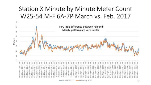
This was a major market station targeting women 25-54. The lines were an average of all 20 weekdays (M-F 6A-7P) in the survey month and as mentioned earlier, look at the Y axis which goes from 0 to 8 meters. Yes, the peak number of meters in any minute was around seven.
Presenting this in PowerPoint lets you hover over the line to get the discrete peak minute. In March 2017, the peak minute was 7:51AM. In February, it was 7:50AM. When asked about it, the PD said the morning show had a benchmark bit that ran at that time.
The next question was why the meter count dropped precipitously right after the benchmark. Guess what? The benchmark was followed by a stopset! In other words, the peak meter count was given what they didn’t want to hear right after what they came to enjoy. The stopset was quickly moved.
Let’s bring this forward to 2025. A disclaimer about using this analysis is that all of the listening is included in the Audience Flow option. Some minutes in the Audience Flow report may not end up in the ratings because the listening occasion didn’t make five minutes in the quarter hour. Now that we’re down to three minutes to earn the quarter hour, fewer of these minutes are superfluous.
I’m sure some of you know about this analysis or have seen something similar. I liked it because a PD could understand it at once (if the PD just couldn’t get it, the search for a new one should begin shortly after the meeting). Talent could understand it as well if they were in the room. It can be run for any time period and just about any demo as well. And it’s actionable: if you see something as glaring as this instance, you can make changes quickly, because more than ever, every minute counts.
Let’s meet again next week.
Barrett Media produces daily content on the music, news, and sports media industries. To stay updated, sign up for our newsletters and get the latest information delivered straight to your inbox.